Best Practices for Responsive Web Design
 Jessica Lee
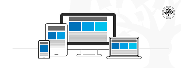
Responsive web design is a fundamental aspect of modern web development. It ensures that websites look great and function well on devices of all sizes, from desktops to smartphones. Here are some best practices to create responsive designs that enhance user experience.
1. Use a Mobile-First Approach
Start designing and developing for smaller screens first, then scale up for larger devices. This approach ensures that your website is fully functional and optimized for mobile users, who make up a significant portion of web traffic.
2. Leverage Flexible Grids
Use a flexible grid system, such as Flexbox or CSS Grid, to create layouts that adapt to different screen sizes. This allows elements to resize and reposition dynamically without breaking the design.
3. Optimize Images
Use responsive image techniques, such as the srcset attribute, to serve appropriately sized images based on the users device. This improves page loading speed and ensures better visual quality on all screens.
4. Implement Media Queries
Media queries are essential for responsive design. They allow you to apply different styles based on the devices screen size, resolution, and orientation. For example, you can hide unnecessary elements or adjust font sizes for smaller screens.
5. Prioritize Performance
Responsive websites should also be fast. Minimize the use of heavy scripts, optimize CSS, and use caching to ensure your site performs well across all devices, even on slower networks.
By following these best practices, you can create websites that are visually appealing, user-friendly, and functional on any device. Responsive web design is no longer optional—its a necessity in today’s multi-device world.
Jessica Lee
Jessica is a UI/UX designer and frontend developer who specializes in creating responsive and accessible web experiences for all users.